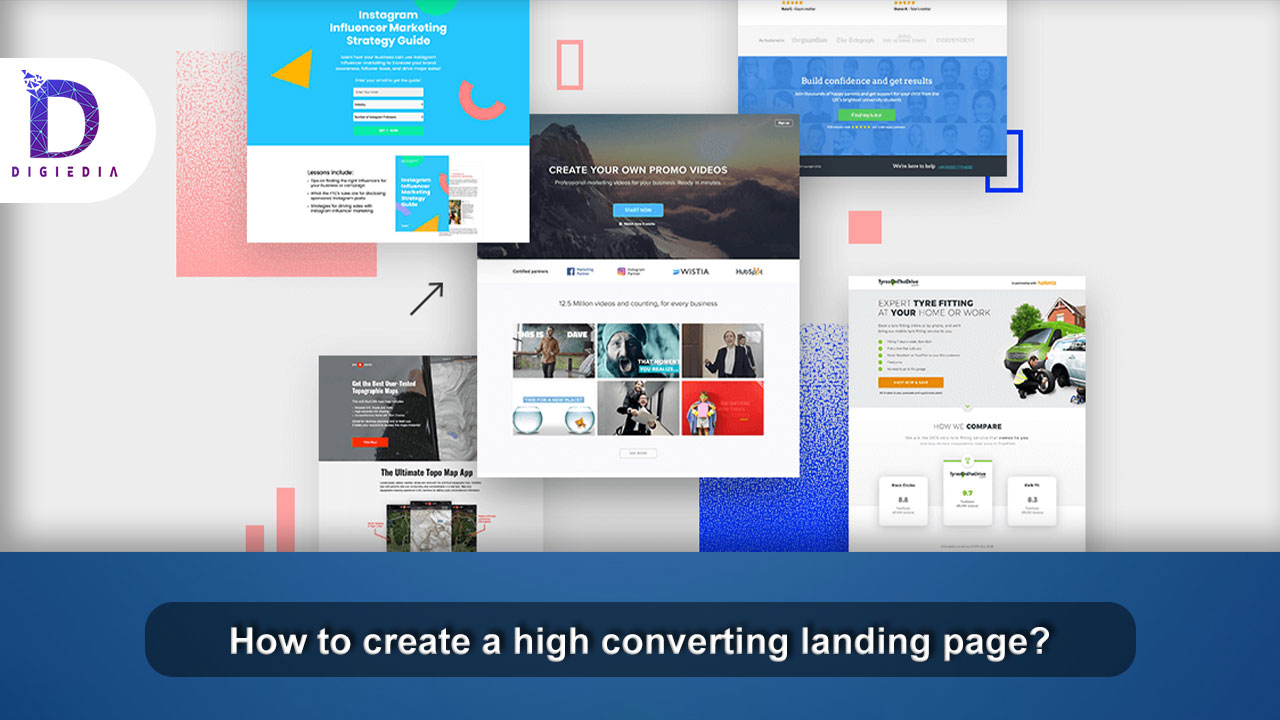
How to create a high converting landing page?
- DIGIEDIA
- Blogs, Digital Marketing, Social Media Marketing
- 14 February 2022
- No Comments
What is the definition of a landing page?
A landing page is indeed a standalone website that is created with the goal of generating qualified leads. Micro conversions on the landing page, such as filling out the forms, joining up for a trial, expressing interest in the product or service, and so on, can help you reach this goal. Warm traffic, or traffic that has expressed interest in your offer, is typically sent to a landing page by marketers. Your visits could originate from a variety of sources, including pay-per-click (PPC) advertising on social media or an email list. Conversion rates on landing pages vary depending on the industry and the goal. As a result, establishing an ideal conversion rate that applies to all industries is unjust. Let’s see how to create a high converting landing page.
A Headline That Kills
Everything starts with a headline: intrigue, attention, and comprehension. It’s what makes a visitor want to stick around and learn more about what you have to offer — or not.
Here’s what it has to achieve:
- The headline must pique the reader’s interest.
- The headline should describe the service or product to the reader.
- The title should be succinct. Make it no 20 to 30 words, and preferably no more than 10.
It’s also worth mentioning that if your title is paired with an image that illustrates the service or product, the copy doesn’t need to be as long.
Subheads That Persuade
The subheadline is the next component you’ll need to make an effective landing page.
If the headline draws the reader’s attention, the subheadline should entice them to stay. These two pieces of copy combine to provide a landing page’s power a one-two punch.
Here are some things to bear in mind while you make yours:
- The persuasion subheadline is usually placed just beneath the main headline.
- A convincing aspect should be present in the subheadline.
- The subheadline can be slightly more detailed and in-depth than the main title.
Pictures
Visual material is an important component of successful landing pages. In fact, visuals are processed 60,000 times faster by the brain than text. This means that the photos on your landing page will have an immediate impact on visitors. This would definitely ensure a high converting landing page.
As you choose and place your photographs, keep this in mind.
- The images should be quite huge.
- The images you use should be related to your product or service. If you’re selling a physical item, you’ll need to include an image of the item on your landing page.
- If you’re advertising a service, the image’s main goal should be to catch the visitor’s attention and demonstrate relevancy.
- The photographs must be of excellent quality.
A justification
Your landing page should make it very apparent what you’re offering.
After all, you’ve lost a potential consumer if they don’t comprehend what your service or product is about. As a result, a clear explanation is essential.
If your homepage is for a straightforward service or product, you could be able to walk away with just the headline and subheadline.
But, no matter how you approach your explanation, keep the following in mind when you write it:
- Your explanation might be combined with or apart from your headline.
- A benefit-oriented explanation is required. Explanations are useful, but their utility should be skewed toward the user.
This will definitely help you create a high converting landing page
Pleasure Has Something To Do With It
Humans are both pain-avoidance machines and pleasure-seeking animals. Every human being is driven by a need for pleasure, which can take many forms.
There are two primary ways to include this on your landing page:
- Demonstrate how owning your goods or service brings you pleasure.
- Demonstrate how your product fulfills an emotional demand in addition to its utilitarian role.
Contact Techniques
Multiple contact methods, such as a mobile number, a street address, an email, and a contact form, are seen on some of the most appealing landing sites to create a high converting landing page.
Some have popups in which a customer support professional asks whether they can assist you.
Here are some things to consider when adding a telephone number to your homepage:
- At the most foundational sense, demonstrate that you really are a legitimate business. This usually includes a physical address as well as a phone number.
- Live chats in a popup can indeed be useful, but they aren’t required. It’s debatable whether or not to use live chat. If you insist on utilizing one, do your research to make sure you have compelling reasons to keep it.
Guarantee
Customers appreciate assurances. A guarantee, no matter what it is or how it is delivered, can reassure visitors while they are on the landing page. Simply saying the word increases the chances of conversion. Here are some things to consider as you construct one for the landing page:
- Guarantees come in a variety of shapes and sizes. Choose a guarantee that is appropriate for your business and includes it on the landing page.
- You could provide a different variety of guarantees in the utter lack of any explicit system certainly (e.g., satisfaction, money back, etc.). For example, “100% No Spam Guarantee.”
- Close to the CTA, place your guarantee statement. This proximity will provide the potential customer with one more bit of assurance before converting.
Conclusion
In any business, the high converting landing pages convert at twice or three times the industry average. If you’re generating these leads through PPC advertising and your landing page has a low conversion rate, you might be paying nearly three times as much per lead as a rival. And you’re clearly at a strategic disadvantage as a result. There is, however, a silver lining. The companies that operate high-converting pages in your niche didn’t make them by accident. They have undoubtedly used rigorous testing to gradually enhance their landing page conversions.
